Interpret the PCA axes
The most commonly used linear dimension reduction method in biostatistics is principal component analysis, or PCA. It is also maybe the oldest one (Pearson, 1901). Linear dimension reductions have the particularity of not distorting the original space, but of offering a specific “point of view”, like a photo is a 2D snapshot of a 3D space. For PCA, this point of view is the axes (or principal components) where the “points cloud” of the data is the most scattered (Figure 1). The tiny difference with photography is that here we have a snapshot in 2D for a space with several thousand dimensions.

The complexity of OMICS has particularly increased since the advent of single-cell technologies: the linear aspect of PCA is no longer sufficient to describe data from 2 or 3 dimensions of the PCA space. This has been the reason for the development and use of non-linear dimension reduction algorithms, such as UMAP or t-SNE. PCA remains a central algorithm for single-cell analysis. It is used for reducing the computing time for other algorithms by reducing the number of dimensions. Generally, a few dozen principal components are retained in the PCA space and removing the axes of variation that contribute the least is also a mean to reduce the noise in the dataset. Nevertheless, PCA for the purpose of representing the data and interpret them is not dead, especially for the analysis of the good old bulk RNA-Seq. Let’s take a deeper look at what PCA is, in the context of RNA-Seq.
The space calculated by PCA is composed of new variables, called principal components (PCs), ranked by the “quantity of change” they explain (percentage of explained variation). For the RNA-Seq, this can be viewed as the percentage of the transcriptome changes that is explained by each PC. The coordinates of the samples in the principal components consist of a mixture of the variables (here the genes expression) (Figure 2). The “proportion” of these mixtures is given by the matrix of gene contributions to the axes (genes eigenvectors, or eigengenes). The existence of this contribution matrix represents a clear advantage over other dimension reduction methods. It allows us to add samples without recalculating the reduced space, and to switch at will from coordinates in the starting space to those in the reduced space. Each principal component is de-correlated from the others and represents a unique axis of variation in the data. One of the exiting thing to do with the PC, is to understand if they represent a biological or technical aspect of the data. If we can do this, we will know what has caused the most impact on our transcriptomes, and what genes are responsible for these changes. In a nutshell, we will understand our data.

Correlate Principal Components and known variables with a PCR…
In the following text, we will use the script and example data from my Bulk RNA-Seq workflow, written in R.
The first thing to do is to link known variables of the experimental design to the PCs. When analysis Bulk RNA-seq data, we are usually beginning with 2 matrices: the count table and the sample annotation (sample sheet) table. The sample annotation table contains the variables relatives to the experimental design (example in Figure 3).
| SampleName | culture_media | line | passage | run |
| P3E07LSP32 | mTeSR1 | LONZA71 | 32 | 3 |
| R3E08MIP01 | RSeT | MIPS3 | 1 | 3 |
| A3E09MIP20 | T2iLGO | MIPS3 | 20 | 3 |
| A3E10MIP25 | T2iLGO | MIPS3 | 25 | 3 |
| E3E11LEJ07 | E7 | LONZA80 | 1 | 3 |
| R3E12BJP01 | RSeT | BJ1 | 1 | 3 |
To see the link between a PC and one of these variables, we just have to perform a linear regression between a PC and the variable, and extract the R-square ! This action is called the Principal Component Regression (or PCR, please appreciate the potential of confusion of this acronym when discussing with your colleagues).
First, we have to perform a PCA on our data, we will use the logCounts to have a matrix that follows a multi-normal law (each gene expression vector follows approximately a normal law). Run the script up to the line 326 to perform a PCA:
pca<-PCA(logCounts)Note, my custom functions, like PCA, are accessible within R by simply typing:
source("https://raw.githubusercontent.com/DimitriMeistermann/veneR/main/loadFun.R")Then, we can perform the PCR. Here we will inspect the variables culture_media, line, run, and passage. The name of these variables are contained in the vector annot2Plot. We will also limit the PCR to the first 10 components.
pcReg<-PCR(pca,sampleAnnot[annot2Plot],nComponant = 10)We can then plot the results (Figure 4).
pdf("figs/PrincipalComponentRegression.pdf",width = 8,height = 5);print(
 ggBorderedFactors(ggplot(pcReg,aes(x=PC,y=Rsquared,fill=Annotation))+
     geom_beeswarm(pch=21,size=4,cex = 3)+
     xlab("Principal component")+ylab("R²")+
     scale_fill_manual(values = mostDistantColor2(length(annot2Plot)))+
     theme(
         panel.grid.major.y = element_line(colour = "grey75"),
         panel.grid.minor.y = element_line(colour = "grey75"),
         panel.background = element_rect(fill = NA,colour="black")
     )
)
);dev.off()
These samples are fibroblasts, reprogrammed into pluripotent stem cells with a specific culture media. The combination of PC1 and PC2 discriminates almost perfectly the culture_media levels: the PC 1 discriminates fibroblasts and stem cells, the PC2 naive (preimplantation like) and prime pluripotency. Each of these transcriptomic states is linked with a specific culture media. PC3 and 5 could be related to more specific genetic background effects, as the cell line is encoded by the variable line. Be careful, this analysis has a major flaw: The R-Squared can be artificially high when the variable is a factor with many levels, or with some levels composed by too few samples. I am working on correcting this problem.
Once we have linked the PCs with known variables, we can inspect which genes are leading to these variations. To do this, we can plot the “circle of correlations” (Figure 4c). E.g. a representation of the contribution of each gene to the PC: the eigengenes! (don’t remember ? See Figure 1).
And for the PCs related to unknown effects?
If we are unable to link a PC to a known variable of the experimental design, we can use the eigengenes to perform a functional enrichment! Hence, we might be able to interpret the PC as a variation of a particular biological trait. I will talk again about functional enrichment on this blog, briefly, they are a class of algorithms that takes 1. One or several databases of pathways/biological terms (Gene Ontology, KEGG…) 2. Output of analysis consisting in gene list of interest, and/or results (like p-values) associated with these genes. Then, the result of functional enrichment is a list of pathway/term associated with measures of their association with the data of interest.
Here, we will use the eigengenes to perform the functional enrichment. To do so, GSEA (Gene Set Enrichment Analysis) seems to be a good fit. Indeed, we need to give to GSEA all genes used in the analysis, and associate to each gene a “score of interest” that will be here the eigengenes of one principal component. For a particular term, if the score of interest of its genes have a non-random behavior, the term will be significantly enriched. I am not a big fan of GSEA results, I observed they are often misleading. I will detail this point in a future post, but for the moment, I can tell that one of the problem of GSEA is to choose a score of interest. This can be hard to interpret in the context of differential expression, but here, we already have our score, and its property are perfect for the use of GSEA!
Let’s try to understand what is the PC6, as it is not strongly associated with any known variable. My PCA function is a wrapper of the R function prcomp, hence the eigengenes are stored in the slot rotation of the PCA result. We will take the 6th column that correspond to the eigengenes of PC6. We will also use my GSEA wrapper (Enrich.gsea) that automates a lot of tasks to perform functional enrichment and takes in input a numerical vector named by the gene symbols. Note that when we have a 2D matrix with row and column names (like the eigengenes matrix), and we take one row or one column, it is automatically converted to a named vector.
enrichResultsGSEA<-Enrich.gsea(pca$rotation[,6],database = c("kegg","goBP"),species = "Human",returnGenes = TRUE)
View(enrichResultsGSEA)
Here we used KEGG and GO biological process as tested databases, but each time we will run this code they are downloaded and processed. We can pre-compute the databases for the functions and other specific data relative to the species. Note that if you use my workflow, these objects are already existing.
species.data<-getSpeciesData2("Human")
geneSetsDatabase<-getDBterms2(rownames(logCounts),speciesData = species.data,returnGenesSymbol = TRUE,database=c("kegg","goBP"))

enrichResultsGSEA<-Enrich.gsea(pca$rotation[,6],speciesData = species.data,db_terms = geneSetsDatabase,returnGenes = TRUE)
View(enrichResultsGSEA)
We can then plot the results as a volcano plot (Figure 5a), with the NES (New Enrichment Score) that will act as a “Fold-Change” of each term:
pdf("GSEA_volcano_PC6.pdf",width = 11 ,height = 10)
  print(ggplot(enrichResultsGSEA,aes(x=NES,y=-log10(padj),color=significant))+
    geom_point()+theme_bw()+scale_color_manual(values=c("grey75","black"))+
    geom_text_repel(data = enrichResultsGSEA[order(enrichResultsGSEA$pval)[1:15],],
    aes(x=NES,y=-log10(padj),label=pathway), inherit.aes = FALSE,color="grey50"))
dev.off()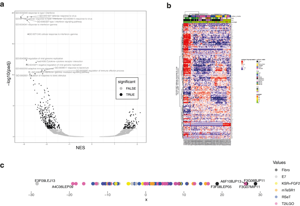
We can also plot the heatmap of each enriched term (example in Figure 5b) and the coordinates of samples in PC6 (Figure 5c).
pdf("GSEA_heatmapPerPathway_PC6.pdf",width = 10,height = 15)
 for(i in 1:nrow(pathwayToPlot)){
     term<-pathwayToPlot[i,"pathway"]     genesOfPathway<-pathwayToPlot[i,]$genes[[1]]     genesNotNA<-genesOfPathway[genesOfPathway%in%rownames(logCounts)]     db<-pathwayToPlot[i,"database"]     if(!length(genesNotNA)>2) next
     heatmap.DM3(logCounts[genesNotNA,],
                             sampleAnnot = sampleAnnot[annot2Plot],colorAnnot = colorScales[annot2Plot],
                             row_title=paste0(term,"\nFrom ",db,", ",length(genesNotNA),"/",length(genesOfPathway)," genes detected")
     )
 }
 dev.off()

proj1d(pca$x[,6],group = sampleAnnot$culture_media,colorScale = colorScales$culture_media,plotLabelRepel = T,pointSize = 4) #coord of PC6
We can observe that more a sample has negative coordinates on PC6, more he will express genes relatives to immune response and viral infection. The fibroblast has been transfected with the pluripotency factor by the Sendai virus. Thus, we can raise the hypotheses that the PC6 discriminates the presence of Sendai virus left in the cell line. With that in mind, the next step could be to test those line for Sendai virus!